Wanom: A Fun, Cool Display Font for Digital Brands
It started with a hero section—just me, a new coaching site wireframe, and that familiar moment when the default heading font felt *too safe*. I’d already tested three clean sans serifs, but none carried the quiet confidence and playful energy the brand needed. Then I dropped in Wanom. Instantly, the headline popped—not aggressively, but warmly, like someone leaning in with a smile before sharing great news. That’s when I knew this wasn’t just another display font. It was a digital tone-setter.
A Typeface That Speaks Before You Scroll
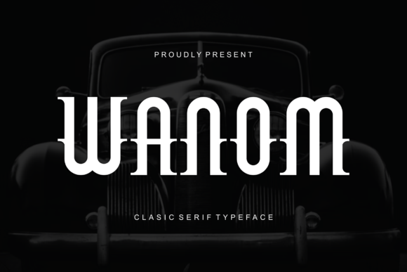
Wanom is a modern display font with relaxed curves, subtle contrast, and a breezy rhythm that feels both intentional and effortless. It’s not overly geometric, nor does it lean into retro or script tropes—it occupies its own friendly, contemporary space. The letterforms have gentle openness (great for readability at size), balanced spacing, and a slight upward tilt in the baseline that gives even static text a sense of light movement. Visually, it lands somewhere between approachable editorial design and confident brand identity—ideal for websites where personality matters as much as clarity.
I tested Wanom across real layout contexts: a boutique online store banner, a course sales page headline, a portfolio project title over a muted background image, and even a sticky CTA bar on mobile. In every case, it held attention without demanding it—and crucially, it didn’t compete with content. It supported the message instead of overshadowing it.
Where Wanom Shines (and Where to Pause)
Wanom excels in short-form, high-impact roles:
- Hero headlines and section titles — Its generous x-height and clear shapes scale beautifully from desktop down to tablet.
- Call-to-action buttons — Especially on light backgrounds, where its friendly weight adds warmth without sacrificing legibility.
- Logo lockups and wordmarks — When used sparingly (e.g., “Studio” or “Collective”), it conveys craft and care.
- Blog post headers and featured quote graphics — Gives editorial rhythm while staying distinctly ownable.
- Digital brand kits and campaign landing pages — Adds cohesion across social banners, email headers, and web visuals.
That said, Wanom isn’t built for long paragraphs, navigation menus, form labels, or small interface text. Its decorative charm fades below ~18px on screen—and on dark mode or low-contrast overlays, some characters (like lowercase a or e) soften too much without careful testing. For accessibility and scannability, always pair it with a highly legible sans serif—think Inter, Manrope, or even a crisp system font stack—for body copy and UI elements.
Responsive Behavior & Real-World Readability
On mobile, Wanom performs best above 24px in headlines and benefits from generous line-height (1.3–1.4) to preserve breathing room. I noticed it renders cleanly across Chrome, Safari, and Firefox—but on older Android WebView instances, hinting can vary slightly. If you’re deploying it via self-hosted @font-face, ensure the WOFF2 file is included and fallbacks are defined. It’s not a variable font (yet), so check whether your license includes bold or italic variants—or if you’ll need to rely on CSS font-weight simulation (which isn’t ideal for display fonts).
One unexpected win? Wanom works surprisingly well over soft image overlays—especially blurred or gradient-tinted backgrounds—because its letterforms maintain enough internal contrast to stay distinct without needing heavy text shadows. Just avoid pairing it with busy textures or tightly packed patterned banners unless you test contrast ratios manually.
Smart Pairing for Cohesive Digital Identity
Wanom pairs naturally with neutral, humanist sans serifs: Inter for clean tech-forward sites, Lato for warm service brands, or Poppins for energetic creative studios. For more editorial or premium-feeling layouts, try it with a refined serif like Cormorant Garamond or Literata—but keep serif usage strictly to bylines, captions, or pull quotes. Never stack two decorative fonts; Wanom’s personality is strong enough to anchor the hierarchy on its own.
I also tested it alongside a subtle handwritten accent font (for signature-style subheads)—and while charming in mockups, it diluted focus in live user testing. Less is more. Wanom doesn’t need backup dancers; it needs thoughtful space and smart contrast.
Licensing, Formats, and Practical Checks
Before adding Wanom to client sites or SaaS dashboards, verify your license covers web embedding and commercial use—especially if you’re bundling it into templates or white-labeled products. Most reputable vendors include WOFF2, WOFF, and EOT files, plus basic OpenType features like standard ligatures and stylistic alternates (check the specimen PDF!). If your project requires multilingual support—say, for an international coaching audience—confirm Latin Extended-A coverage and diacritic clarity. Some display fonts skimp here, but Wanom handles accented characters like é, ñ, and ü with consistent spacing and weight.
Finally: preview it in context, not isolation. Drop it into your actual CMS or builder—even if just as a temporary style override—and scroll through real content. Does it still feel right next to product photos, testimonials, and pricing cards? That’s the true test. Wanom isn’t about perfection in a specimen sheet. It’s about resonance in the wild.